¿Qué es Data Viz?
Interactive tools for analyzing large data sets
The application of techniques and knowledge in Ux Design and User-Centered Design (UCD) allows us to remain at the forefront of content and big data visualization strategies, making it easier to understand data and metrics
We leverage this expertise to develop tailored applications that highlight our clients’ scientific capabilities and impact across diverse fields.
Goals
Data Viz is designed to offer:
- Analysis of large volumes of data
- Creation of visualization tools to better understand and interpretation of data
Features and Functionalities
of Data Viz
We provide our clients with expert UX and user-centered design services to create custom applications that highlight their scientific expertise and cross-domain impact.
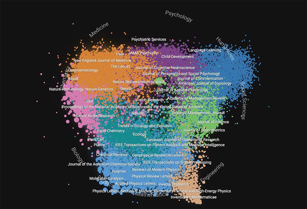
Shape of Science
An interactive map visualizing the scientometric relationships among Scopus-indexed journals, highlighting clusters based on citation patterns and indicating each journal’s impact and prestige according to the SJR.
Another application of this visualization tool is displaying the publication profiles of institutions featured in the SCImago Institutions Rankings, such as the Universidad Nacional Autónoma de México.
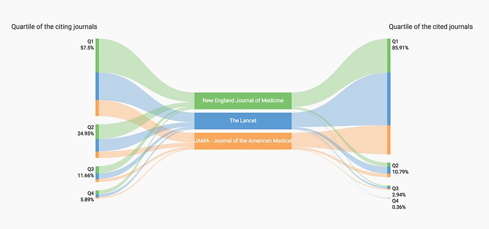
Journal Comparison
A set of visualizations designed to compare journals’ scientometric indicators, incorporating SCImago data such as citation and reference distributions by quartile and by journal.
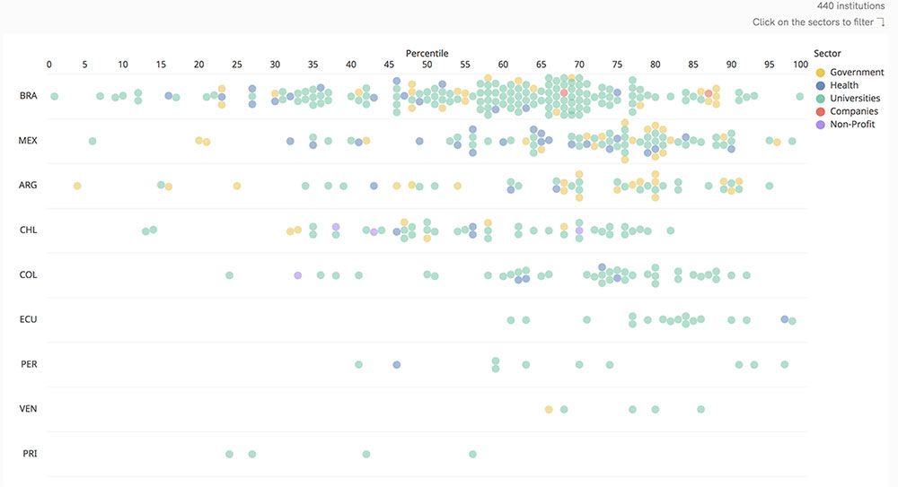
Infographics
The SCImago Institutional Rankings (SIR) include infographics that illustrate the distribution and performance of institutions based on their scientific output, as well as support the geo-analysis of institutions globally.
Benefits of Data Viz
We provide solutions and added value to our users


Governments, Universitis, Research centers, Researchers, Publishers and scientific journals, Libraries
- Interactive and agile visualizations that allow for in-depth data analysis
- Accessible from any device
- Configurable to align with the structure and attributes of the dataset